The Sandbox
Game Maker UI Redesign (Conceptual)
While exploring user-generated content (UGC) tools for metaverse platforms, I used The Sandbox’s Game Maker tool to create land and an animated character to inhabit that land. In this process, I was struck by the difficulty of using the tools, which were marked by confusing UI and workflow. As I recorded my observations and experience, I began forming a concept design for UI improvements for the tool.
Problem
The main issues I encountered:
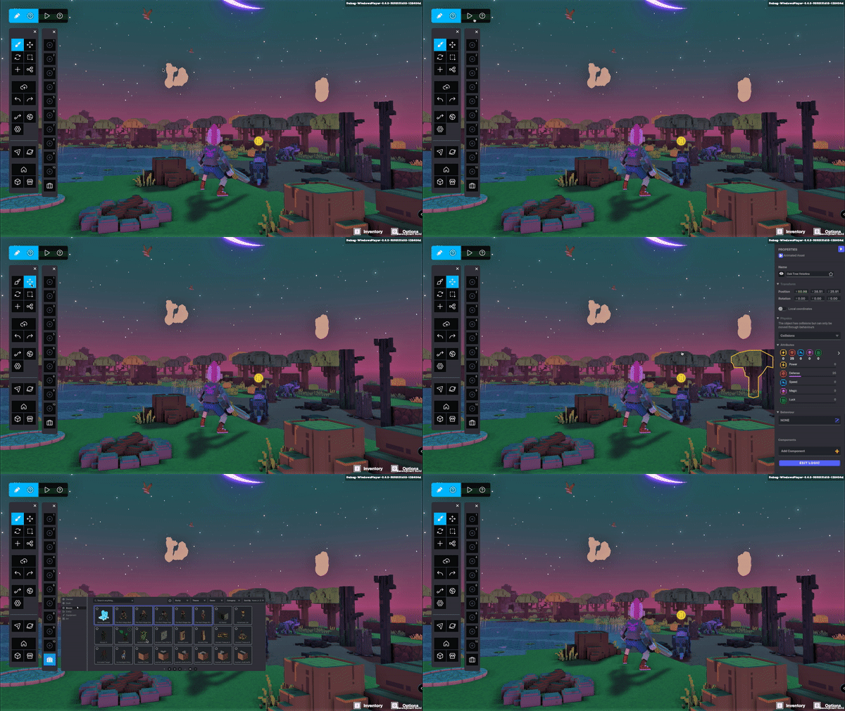
Functional UI is spread to all sides as well as the middle of the screen, taking up valuable space that could be used for viewing the resulting creation
Associated functions not grouped together, hierarchy unclear
Inefficient UI layout increases cognitive load (user has to look for buttons spread over all corners of the screen and move cursor from end to end to navigate between functions)
Current Sandbox Game Maker
Solution
I took a look at some competing platforms as well as taking my own irritations into account, and put together a solution focusing on the following aspects:
Use UI space more efficiently; maximize creation/viewing area
Better functional grouping and hierarchy of buttons, to make UI easier to learn and more efficient to navigate
Clearer visual distinction between Edit mode and Play mode
Consistent icon set to replace different styles of icons as well as variations between buttons with text and buttons with icons
Conceptual redesign to better organize the UI, maximize creation/viewing space and more clearly distinguish the playing and editing modes
Prototype
I also created a prototype as a sanity check; it gave me a better sense of how the changes actually worked and felt. It demonstrated switching between play and edit mode, navigating the more efficient UI, selecting an item while in edit mode, as well as accessing the asset inventory and functional shortcut guide.

